LUTs, overlays, transitions and Lottie animations.
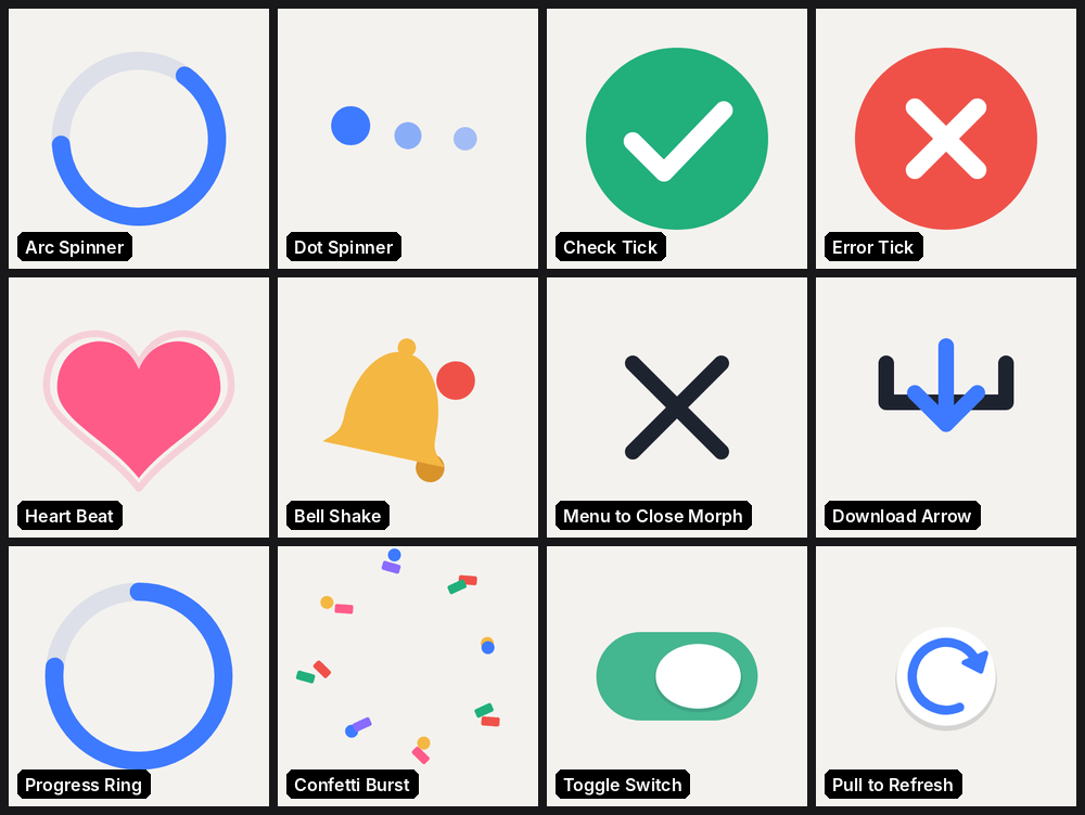
Twelve hand-authored Lottie UI animations: two spinners, success and error ticks, heart, bell, menu morph, download, progress, confetti, toggle and pull-to-refresh.
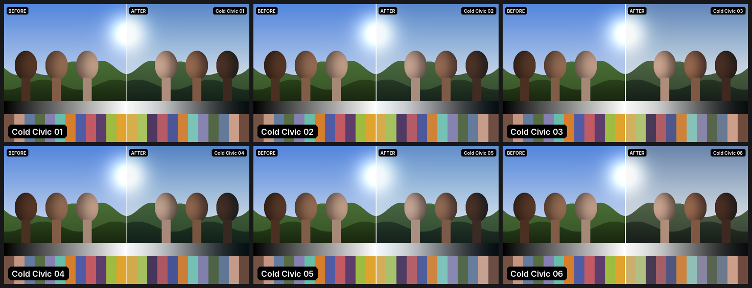
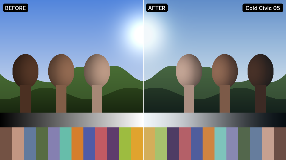
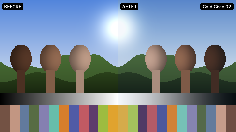
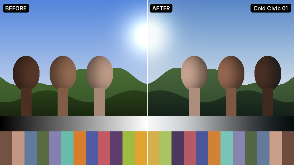
Six cold urban grades: desaturated teal shadows, hard contrast and skin tones kept clean and neutral.
iOS-style toggle: the knob slides across with a stretchy squash while the track fades from grey to green.
Three dots that rise, grow and brighten in a wave: a calm 1.2 s loop for loading and typing states.
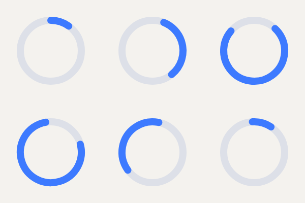
A material-style loading arc that grows, chases its tail and rotates: one seamless 1.5 s loop.
Pull-to-refresh puck: slides down rotating with the pull, spins as a loader, then shrinks away.
Circular progress: the ring fills with an ease, a centre dot pops on completion, then the ring sweeps clear.
Hamburger icon that morphs into a close X and back with true path morphs, not a crossfade.
A pink heart with a lub-dub double beat and an outline ripple: a 1.5 s loop for likes and favourites.
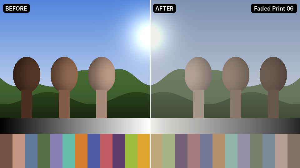
Chalk: the lowest-contrast, brightest print in the pack; a pale, quiet finish.
Failure state: a red disc pops in, the cross draws on, then a short decaying 'no' shake before it settles.
Download icon: the arrow drops in, bounces, then falls into the tray, which squashes to catch it.
Glass tower: crisp blue-steel highlights over teal shadows, clean corporate contrast.
Overcast: a grey-sky civic grade with cool highlights and teal-grey shadows.
Cold civic: desaturated teal shadows, neutral skin, hard modern contrast.
Success confirmation: a green disc pops in with a little overshoot, a ring ripples out and the tick draws itself on.
Notification bell that rings from its top pivot with a lagging clapper and a pulsing red badge, then rests.